How to Design Perfectly Looking Footer?
The footer is the footer area of the site below the main content. From a small service area, it has long turned into an important element that encloses the entire structure of the site. In modern web design, a footer can take many different forms, but its presence is always critical in terms of user experience. It serves as a guide for visitors, acts as an additional navigation, keeps people on the site and generates leads. Specialists of website design company Fireart are ready to make any project. Get more info https://fireart.studio/web-design-services/.
Why is it wrong to underestimate the footer?
The content located on the first two screens receives the main percentage of user attention – here visitors spend 74% of all time1. It is in the header that the most priority information is always placed, but this in no way diminishes the value of the footer, especially when it comes to e-commerce sites.
Distribute user attention as you scroll through the site
Despite the fact that the bottom area attracts incomparably less attention than the first screen of the site, underestimating the footer when developing a project is a gross mistake.
What a footer can do

Emphasis on the main thing. The basement contains information that is mainly available in other places on the site, but the fundamental difference between the footer is that everything is displayed here briefly, logically and as clearly as possible. That is why many users do not want to collect information by sections, but immediately go down, where all the basic data – contacts, company information, etc. – clearly collected in one place.
Site navigation.
If the user went down to the footer, most likely he did not find what he was looking for at the top. Placing duplicate navigation links, as well as information that did not find a place in the main menu, increases the usability of the site, extends the duration of the session and improves behavioral factors that play an important role in terms of SEO promotion.
Growth in lead generation. Footer interfaces give the user a second chance to make a decision, which is especially important for e-commerce sites. A well-designed basement helps retain customers and encourages them to take targeted actions.
A way out of the search deadlock. From time to time, everyone who uses the internal search for online stores gets to the blank page “Product not found”. Whether the user will continue to perform targeted actions in this situation largely depends on how well the way out of the UX deadlock is implemented. A footer with links to the main sections of the store is the simplest solution to this problem.
Creating a footer for different categories of sites. Brief Recommendations
The optimal footer configuration and the list of components included in it depend primarily on the type of site. The footer is created with a focus on the structure and scale of the resource, taking into account the activities of the company, as well as the characteristics of its target audience. We will list the main elements used in the footers of different sites.We are talking about simplified website navigation designs – links leading only to the main sections.
When choosing which elements to place in the basement, start from the purpose of the resource and the significance of the information to the user. Put yourself in the shoes of your client: what he should learn and see in the first minutes of contact with the site – this information and give priority.
Navigation links.

While browsing the site, we scroll down the page – and in case of uselessness of the found content (“We must scroll to the end, suddenly the most important thing is below”), and if we immediately find the information we are interested in (“We must read it to find out the details”).
In both situations, we find ourselves in the footer of the site. In the first case, the footer can still help the user find what he is looking for: other sections of the catalog, a blog with reviews. In the second, it can lead to conversion when a potential buyer has already made a choice and wants to immediately get into the section on delivery or payment.
In addition to navigation links, it is useful to place a link to an HTML sitemap in the footer for easy information retrieval. The map should reflect the hierarchical structure of the site and contain HTML links to all main pages and sections. It is important to update it when new pages appear.
Here we see navigation links to the main sections:
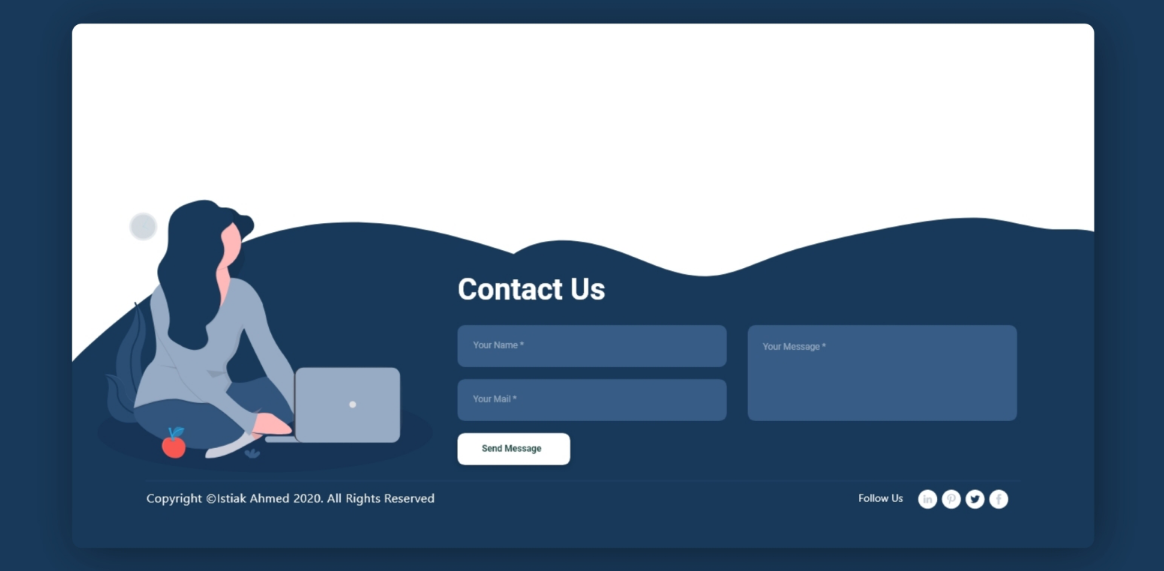
Contact Information.
In one case, it is advisable to post a brief, in another – full contact information. For B2C sites, a short form is enough: address, e-mail, telephone. If the site is also designed for a B2B audience, indicate the legal and actual addresses, e-mail, fax, working hours and other information important for your partners.
The site should have a separate page with detailed company contact information, legal entity information, etc., but the footer is the perfect place to indicate the priority ways to contact you. And don’t forget to make sure that the information in the footer matches the information in the Contacts section.
Feedback or subscription form.

An element that is as useful to the user as the contacts. It allows you to promptly leave an application, send a request, subscribe to news or mailing lists, and the company can receive data from a potential client for subsequent interaction with him. Placed in the footer, such a form is available to the user on all pages of the site, which increases the likelihood of conversion.
The feedback form should be simple and straightforward – do not try to fit several fields here, as when registering a user. A name, phone number and (or) e-mail is enough.
The online store added a subscription form to its newsletter in the footer. In addition to being interested in the user’s gender identity, the company is probably building a newsletter strategy, addressing different offers of the store to users of different genders:
When posting any forms on the site for specifying user data, remember that you must familiarize him with the privacy policy and the processing of personal data. Links to these sections and documents can be placed here.
Social media buttons.
If your company has active social media pages, link to them in the footer. Active user clicks on social media buttons affect the perception of the site by search engines, increasing its position in the search results. You should not add links to social networks that you have created “for show” and which do not follow the relevance – in this case, you are more likely to alienate the visitor.
Copyright information.

Copyright – information about the copyright for all information presented on the site. This field should indicate the current year so that the user does not have the impression that the resource has not been updated for a long time:
- Indicating the date of the last changes in the footer of the site
- Additional elements that can be placed in the footer:
- Directions map or a link to it.
Site search block.
Facilitates the user the path to the desired action, especially in the case of large sites where it is difficult to visually display the entire range or create a large number of filters.
Legal information of the company or a link to it. An element that increases the degree of trust in the site and the company as a whole.