7 Essential Web Design Tips for Beginners – 2024 Guide
The look of the website is said to make or break the brand, and if you don’t make the right choices, no matter how good your products or content are, chances are, you will repel potential customers. In today’s digital world, there are so many different things that you need to pay attention to, but at the same time, there are also so many tools that can help you make the right decision. If you are getting into web design, you are probably wondering what you need to do, what you need to steer away from, and how to make the best choices in order to create a site that sells. In this 2024 guide, we are going to give you some essential web design tips for beginners.
Continue reading if you want to learn why you should follow these tips and how they are going to help with sales, marketing, and overall brand exposure.
1. Pay attention to the fonts

When we design a new page, we know that the type and size of letters we use are going to be one of the first things our users notice. If you want to raise awareness and share your message, no matter what that is, you need to be smart when choosing the fonts.
Don’t go with things that are too difficult to read, and use cursive only to make a point in a few words. Experts suggest that you should never use more than three typefaces and you should position them to make the biggest impact.
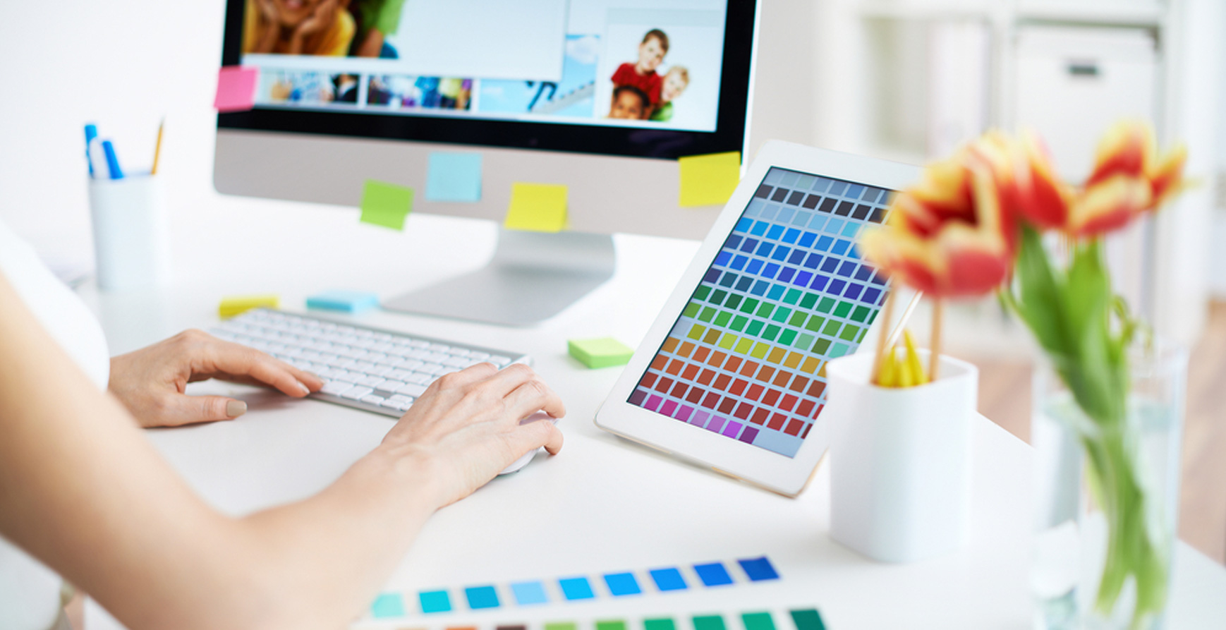
2. Selecting the right color scheme is a must
Picking the right hues for your page is a really important thing, and you need to be aware of how colors can affect the behavior of customers. Depending on the scheme you go with, you may influence them to spend more time on the page, choose to buy your goods, or you will just repel them.
You can always use the brand colors, and you can incorporate them in different parts of the content, but make sure you keep to natural and neutral tones, so you don’t make your users’ eyes sore.
3. Keep in mind the different screen size

When we design the look of the site, we almost always use a laptop or a PC. When we are done with things, they may look perfect on our size screen, and everything may seem like it is looking the way we want it to.
However, don’t forget that most of your customers will open your page via their smart devices, and this means that you need to optimize the site for all screen-size users. Compare to smaller laptops, tablets, and phones and make sure that everything works there as well.
4. Optimization is key
Your website needs to be optimized to help you raise the exposure and help users find it even without looking for it. According to EZ Rankings, the easiest way to do that is to use SEO services that will help you generate traffic, sales, and leads.
Note that you should do this right from the start, and it is much easier to optimize a site that is brand new than to go back to every single thing you’ve created and try to change it to make it more visible on different platforms. Collaborate with the right service that will help you reach your goal, and that will make a difference in the overall look of the website. Remember that optimization is not only done in the text but also affects every part of the content.
5. Menu and navigation
Now let’s talk about the look of the menu and the overall navigation through your website. When it comes to the menu, you should never confuse your viewers, and you should never make it difficult for them to find what they are looking for. When creating the design, you should put some of the categories directly visible, but everything else needs to be put in the dropdown menu.
Don’t put too many things on the front page, keep it simple and easy to navigate, and on the same note, separate things by categories so that people can find what they are looking for. Never forget about the search bar and label things with keywords for easier access.
6. Leave room for images
When we plan our initial look, we rarely think about the things that are going to come after. This includes banners, images, galleries, and other different types of multimedia. The design you are creating now is not finished until the site is live and filled with content.
Know that people are more likely to get attracted by the photo than to pay attention to the headline or the few lines that come after. So, plan accordingly, leave room for multimedia, and try not to overcrowd the look after you add all the things you’ve planned.
7. Simple is better

The last thing we are going to talk about is simplicity. As we mentioned before, you should never overcrowd the design with too many different fonts, colors, or even too many images. You need your clients to be able to find their way around the site, and you need things to be straightforward.
Even though this does not mean you need to compensate for looks or patterns, you just need to be smart about the overall look. You can even leave some blank spaces, and you should know that you don’t need to have every surface covered with something.
These are some of the things that will help you create a perfect design for your page. It may not look easy, but once you start doing it, you will see the mistakes you are making, you will make the necessary changes, and ultimately, you will create a better and safer space for your readers. Change things up depending on the type of brand you are promoting, and remember that if you don’t have any experience with this, or if you just don’t have time to invest in separate things, you can always collaborate with a service that will help you reach your desired goal.